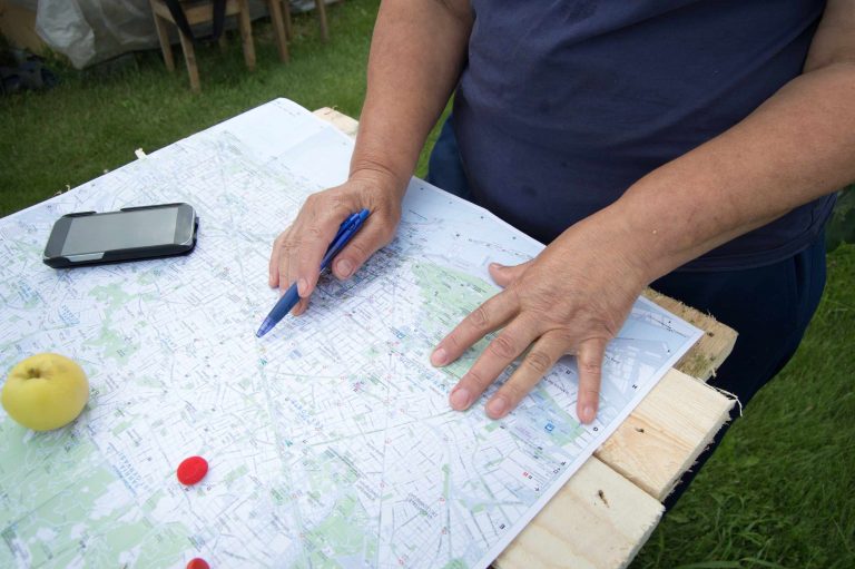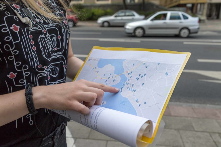

Picture a map with a bold red boundary, equally weighted road lines, deep blue rivers, heavy type for place names, and multiple hues of saturated thematic data. It might have all the right information, but the reader won’t know where to start. Using visual hierarchy allows you to assign relative emphasis to the different map elements, establishing a visual path to read a map, starting with the theme and moving outward to geography.
Determine what the map will highlight before altering any color or style properties. On a reference map, for instance, roads and place names should be emphasized, whereas on a thematic map, you typically want to emphasize the themes over geography. After you’ve determined the primary emphasis, you can set up a hierarchy around the base map, boundaries, water features, and labels. By giving everything the same amount of contrast, saturation, and line weight, supporting map features can take precedence over the primary theme, instead of serving as supporting elements.
Adjusting line weight is one of the simplest ways to introduce hierarchy. For example, the primary boundary could be thicker than a secondary boundary, and minor roads could be thinner than major roads. Rivers should have enough line weight to be clearly visible, but should not appear more significant than a boundary. Point features should also vary in size, but not so much that they lose their ability to be distinguished when printed. Subtle changes tend to work better than radical changes, since drastic shifts make it hard to see fine detail and can cause the map to feel disjointed.
Similarly, color should be adjusted based on what needs to be emphasized. High-saturation colors stand out, so they should be used sparingly for what is most important. An under-emphasized base map with subdued colors can help a thematic layer emerge. When distinguishing between many classes of data, pick colors that are distinguishable without being uniformly loud. Try viewing the map in grayscale. If the primary theme disappears when viewed in grayscale, it’s likely too dependent on the use of color alone and not enough on value, contrast, and other symbols.
Labels are an important way to introduce hierarchy. A title should be more prominent than a citation, for example, and a city name should be distinguishable from a town name. Varying font size, font weight, character width, and placement helps to differentiate them. Labels should also not obscure point symbols or run over important linear features, and they shouldn’t be clustered too tightly together. Often, choosing between two or three options for label placement can reveal an option that balances legibility and geographic reference.
It can also be helpful to make a copy of a small map, and create two versions: One where all the map elements, roads, boundaries, water, labels, and thematic layer, are equally emphasized; and a second where all map elements except the primary theme are muted and underemphasized. Compare both versions side-by-side at the intended size (on the screen or paper), not while zoomed in. Notice which version communicates the topic of the map more quickly and identify where the eye travels first and second on each map.
Using visual hierarchy doesn’t mean sacrificing important information, it simply means determining what should be noticeable first, what should be noticeable second, and what should be quietly available for further study. Once you’ve finished designing the map, step away for a moment and then come back to it at full size. The feature you notice first should match the primary topic of the map. If something else, like a boundary, label, or graphic, draws your eye first, then it’s time to revisit that map element.