
Readability First
Begin with the map’s main message before adding decorative detail or strong visual effects.
Focused Comparisons
Compare alternate palettes, label positions, and symbol sets to see which version communicates more clearly.
Small Corrections
Refine spacing, contrast, line weight, and alignment through manageable adjustments rather than redesigns.
Final-Size Checks
Review each map at its intended screen or print size to catch weak contrast and unreadable details.

Practice Through Visible Decisions
A clear map develops through repeated choices about hierarchy, symbol size, feature density, labels, white space, and supporting elements.
Course exercises make those choices easier to inspect by using focused map areas, alternate versions, grayscale previews, and final-size export checks.

Observe The Reading Order

Compare Alternate Designs

Refine The Final Layout
A Repeatable Review Process
The first review asks whether the mapped subject is immediately visible. Roads, boundaries, water, labels, and thematic layers should not all demand equal attention. Adjusting line weight, saturation, and symbol size helps establish a clearer visual hierarchy.
The second review checks consistency. Point, line, and area symbols should match the legend, labels should avoid collisions, and related elements should use compatible type sizes, fills, and strokes throughout the map.
The final review looks at the complete composition. The title block, legend, scale bar, source note, map frame,
and white space should feel aligned and balanced
when viewed at the actual export or print size.
Notes For Better Map Decisions
Explore practical explanations of hierarchy, color, labeling, symbols, simplification, and layout review.

Placing Labels so They Don’t Obstruct the Data
What happens if the name of a city overlaps its marker? What happens if the name of a river intersects its shoreline on a diagonal? What happens if the name of one town overlaps another? All of these situations are…
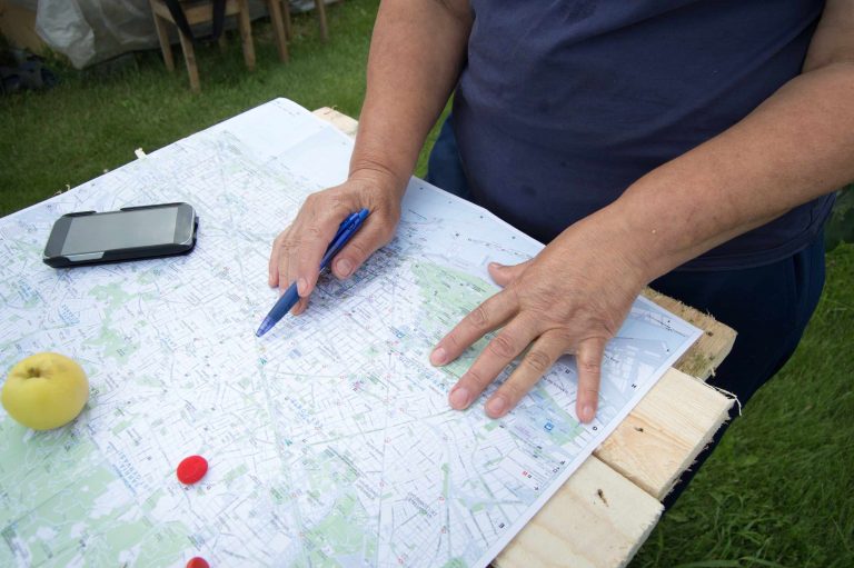
A simple approach to building a readable map color palette
Start by opening a small map, then turn off every color except gray. Then figure out which layer carries the main message. This could be a layer that shows population groups, land use, elevation bands, or something else. Bring back…